All About the Repress:
Redesigning Frank Turner's Album Artwork for Vinyl Fans
- 22/12/2016 -
2016 saw the repress and re-release of a host of Frank Turner's older releases for vinyl. Rather than simply rehash what had been done before, Xtra Mile Recordings, Frank Turner and designer Evan Cotter wanted to give fans more satisfactory packages for their money. Love Ire & Song, Poetry of the Deed and England Keep My Bones were all redone, while the tenth anniversary edition of Campfire Punkrock was deliberately distinct from previous limited vinyl presses of the EP. Evan takes us through his thoughts and processes on these records (and a few others).
Like the look of some of these images? Want the best vinyl press currently available of these Frank Turner albums? Links to our shop are below.

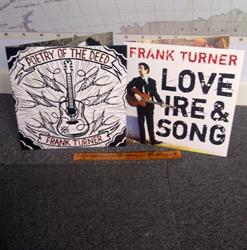
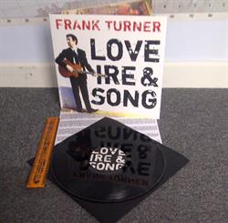
Buy Love Ire & Song vinyl repress

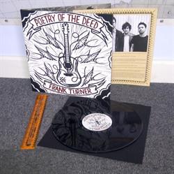
Buy Poetry of the Deed vinyl repress

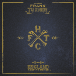
Buy England Keep My Bones vinyl repress
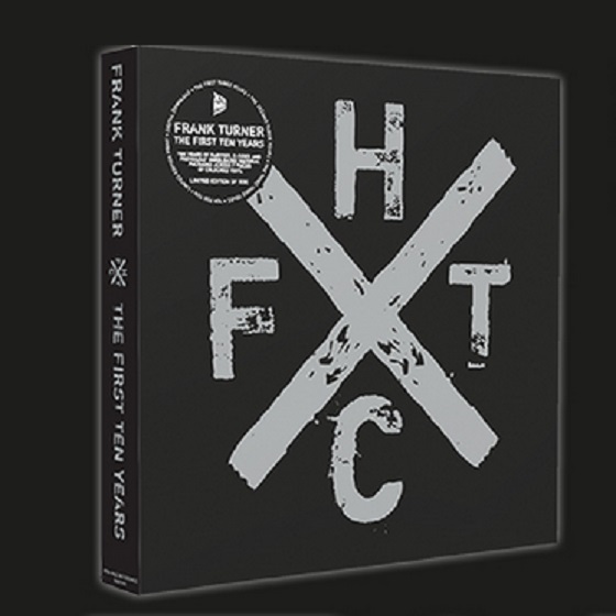
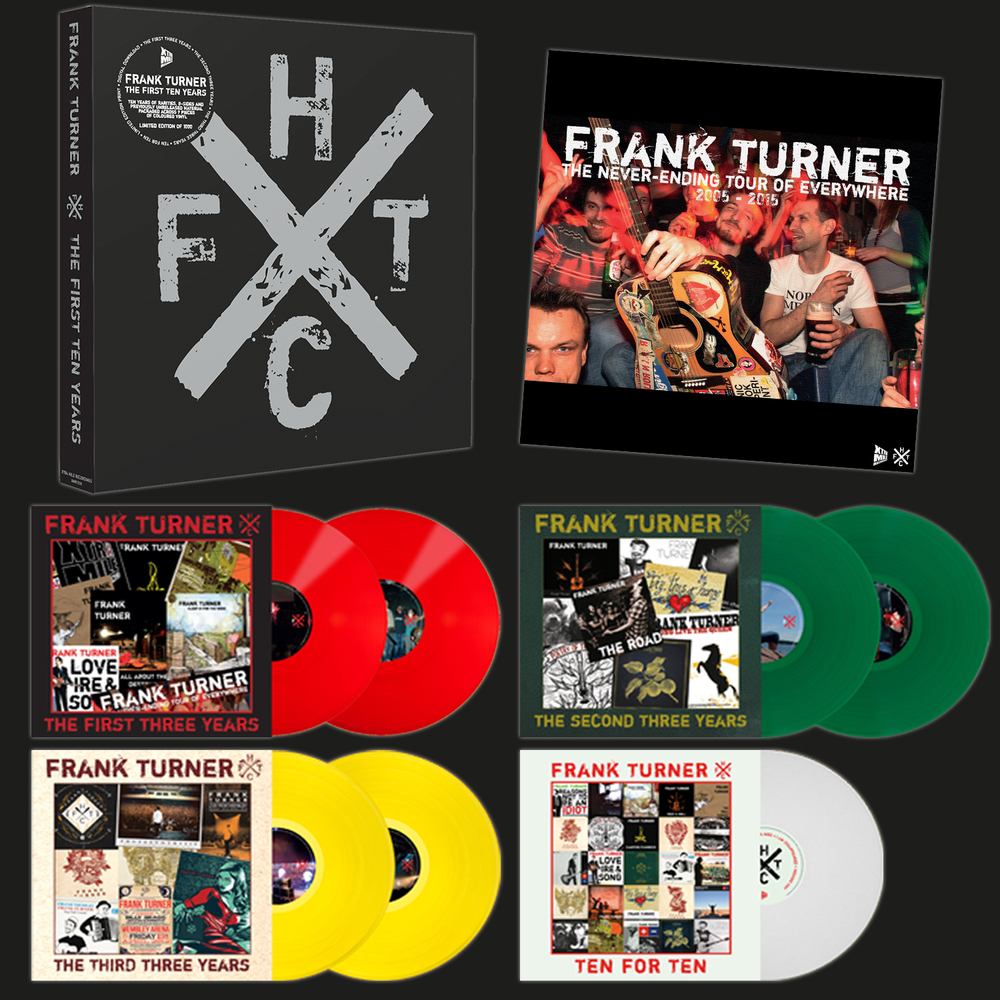
(Sorry, Campfire Punkrock and The First Ten Years box set have both been sold out for a while with no confirmed plans to repress).
XMR: You've done a lot of / all the FT reissues and represses and other XMR releases for a while. What were your aims for the artwork of these ones this time round?
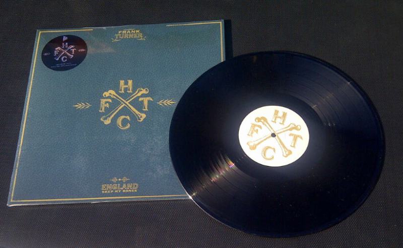
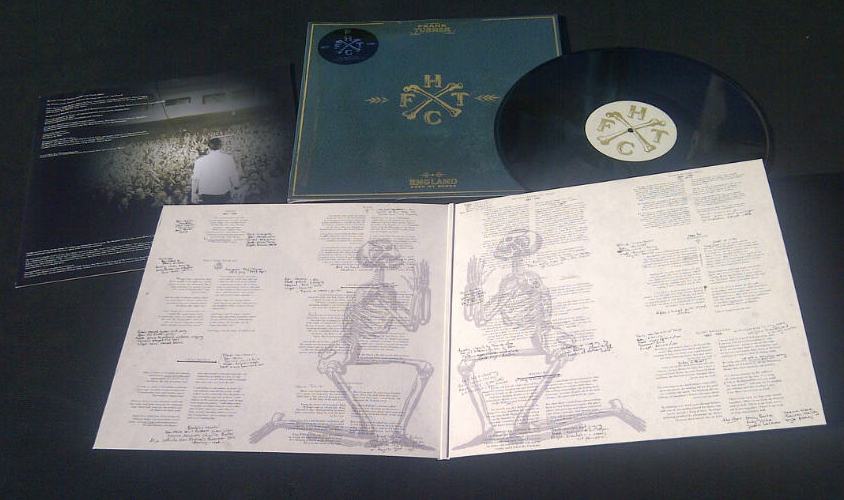
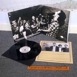
Evan: After the overwhelming success of the First Ten Years box (which had almost entirely sold out before it was even released), Bradley from Kartel emailed me toward the end of 2015 about potentially repressing England Keep My Bones. The original pressing of that record was done by Epitaph and, in my opinion, it was a bit of a disaster. The CD artwork is so impressive that I always felt the LP was a missed opportunity, so I saw it as a chance to right some wrongs.
The idea with that one was to improve on the quality of the original pressing by rethinking the layouts and tailoring the artwork for an LP sleeve rather than simply making a record from CD artwork. And that idea has been carried forward with the other releases.
When these records first came out, there was far less interest in vinyl than there is now, and also a lot less interest in Frank. Records cost considerably more to make than CDs, and therefore a small label like Xtra Mile is not going be all that keen on investing money that may take years to recoup. So I think that the original pressings all suffered slightly from budgetary constraints, and none of them really did justice to the artwork.
For those who don't know that it's more than just blowing the image size up a bit for vinyl size, could you take us through a brief tour of the process (and which bit is your favourite to do)?
First thing to decide on is the packaging. After that the pressing plant supply a template to work from. We use a plant in Germany called Optimal who do really fantastic quality records.
After that I do some rough drafts – placing images and text. I usually have a very clear idea of how I want it to look before I start but it’s not until you see it laid out that you really know if it will work or not. Generally I do two or three different layouts then consult with the label and Frank to see which they prefer. Once everyone is happy with the rough layout, the label confirms all the legal text and barcode, and I work on making sure everything is just right.
When I am happy it goes for approval: Anthea from XMR checks the legal stuff, and Frank checks the lyrics and credits. After any changes, it is prepared for print, which involves checking things like the ink coverage, resolution and bleed all meet with the pressing plant's requirements. The plant supply test pressings and art proofs, and once everyone has signed it off, it goes to print.
I couldn’t really say what my favourite bit is, but my least favourite bit is indisputably laying out the lyrics. This can by quite a chore. Before I started doing this I never really gave that much thought to how difficult it can be to make everything fit correctly. But this is definitely the bit that takes the longest. So next time you are looking at the liner notes of a record, take some time to appreciate that someone spent ages making them fit so neatly.
These are, it's fair to say, important records to a lot of people. Does that have any bearing on what you're doing or is it simply you wanting to do the best job you can?
They are important records to me too. I am an avid record collector, so the aim for me is to ensure these would be something that I would want to buy myself. I know myself that if one of my favourite records gets a reissue I am probably going to buy it. So from a collector’s point of view I would ideally like it to be different to what I already have. I know some people feel that this is just a way of fleecing those people to buy the same record again, but I disagree entirely. If you have a first pressing, I think you want it to be easily distinguishable as such. And my motivation to buy a reissue is going to be driven by the differences to that first pressing already on my shelf. So upgraded packing and higher quality pressings are really important to me.
As previously mentioned, the original pressings of these records were done at a time when there was much less interest and budget for vinyl releases. But with an artist like Frank these days you have the comfort of knowing these will definitely sell. That allows you to do a larger run, which in turn reduces the unit price and enables you to spend a bit more on the packaging. I wanted to create a definitive version from which all future pressings will be based.
In short, I want people to hold these in their hands and say “wow”, which I am confident we have achieved.
How much do you and Frank / Xtra Mile / the original artist consult on these? What sort of conversations come out of these discussions?
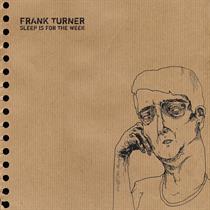
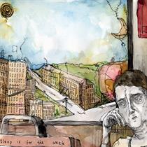
There is obviously consultation with both Frank and the label, but I am lucky enough to have their trust and therefore they pretty much leave me to it. Frank obviously has the final say artwork wise as it is his record, and the label will have their own requirements and ideas - for instance, Anthea from XMR had the idea of the etching on side D of Sleep Is For the Week (preorder now for 27 January 2017!) – so I try to make sure everyone is getting what they need from this. Luckily, there have been very few compromises made from my point of view and those have been down to what is possible to manufacture rather than the label saying no.


What are your favourite elements of each of the album artworks and where do you feel you were able to contribute the most?
That is hard to say, as I like bits on all of them.
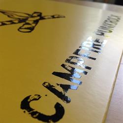
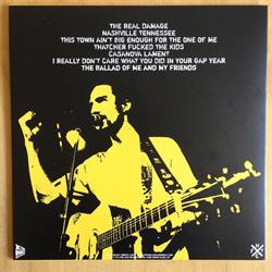
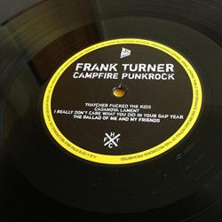
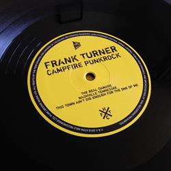
For the Campfire Punkrock reissue I wanted it to be obvious that it was an entirely different release to the previous 10”, and somehow convinced everyone to do a negative image of the cover art. I was a bit nervous about how it would come out to be truthful, but I think it’s great and I am really happy with it.
On LIS and POTD I am really keen on the “hidden” spot gloss elements. That idea was entirely ripped off from the Bowie (★) LP artwork I have to admit, but came out great. As I understand it they should glow under ultraviolet light, but I don’t have one so can’t try (if anyone does and wants to try it out, I would love to see the result).
As it stands right now, I have not seen a physical copy of Sleep Is For the Week as they are still being made. But if it turns out like I hope, I think it will be one of the best things I have done, and one of the best things on Xtra Mile. I wanted to showcase the original artwork in a new light by bringing some of the stuff that was hidden in the booklet into a more prominent role. And I am really excited to see how the outer slipcase works out. We already have the test presses so I know the etching works, but it will be cool to see that on the different colours.
How important do you think artwork is to an album’s success as a piece of work and commercially?
They say you should never judge a book by its cover, but I wonder how many people can honestly say that artwork has no bearing on their purchase. I know I have checked stuff out simply because I liked the artwork or the packaging. But at the same time, unless Monet did your cover art, the music is always going to be the most important factor.
In this day and age, with so many people choosing digital over physical media, I think it is massively important to present a good package. I have a digital streaming account like many other people but I am always going to want a physical copy of an album I like. Therefore, the presentation will always play a massive part in what I choose to buy and the urgency I feel to get it.

If you could give advice to those creating artwork for a vinyl release, what would you tell them to do to make your life easier?
Hire me to do it. I offer very competitive rates. Hahaha!
Failing that, remember how big it will be when printed. You can be a lot more subtle with a record sleeve, so there's no need for enormous logos, barcodes and text. One of the first records I did ended up with THE biggest logo and legal text ever on there, simply because I had no real understanding of how large it would look in print. But at the same time, remember that people also need to be able to read it too. A very common issue with artwork we get handed in is the text being so small that it won’t be legible when printed. Also, don’t do scanned handwritten lyrics – pressing plants hate them, and more often than not they look a bit dodgy when printed.
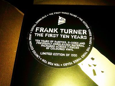
And definitely get someone trustworthy to proof read it. There is nothing more annoying that getting your final copy to discover that there is spelling mistakes. Anyone who got the First Ten Years box set may be aware that there are a number of small errors, which I found massively upsetting. Although not entirely my fault as it went through a process of approvals before print, I do shoulder a hefty portion of the blame, and consequently cannot even look at it now. I genuinely lost sleep over it and even now shudder to think about it. I am a total perfectionist, so mistakes make me angry. These days I get my friend Justin to check everything over. He is a pedant of the highest order and spots things that most people might miss.
And never forget: CMYK, 300dpi, 3mm bleed, and a 320% ink limit.
Which of the FT releases are you most proud of so far, and are there any you're excited to tackle next (not that this has any bearing on release schedules of course!)?
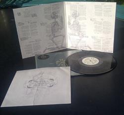
EKMB is probably my favourite (but possibly only because I haven’t got my copy of SIFTW yet). I am a big fan of the artwork, and the original CD layout by Tom Lacey was fantastic. I wanted to make sure that I did justice to that, and I thought the most important thing was to recreate the lyrics with pencil notes as they appear in the CD booklet. As it turns out, this was quite laborious and one of those “who the hell had this idea” moments, but I am very proud of how it came out.
In an ideal world, I would really like to do Tape Deck Heart next, but that was a Polydor release and I am sure that if it were to get the reissue treatment they probably have someone on staff that will do it instead. But fingers crossed if it does get the treatment, it will land in my lap.
If you had the chance to work on getting any album ready for a special edition, reissue or even alternate artwork for, what would it be? You can have a top three if you like.
I would dearly love to get my hands on the Half Man Half Biscuit back catalogue, and do all their albums on 180g vinyl with gatefold sleeves in a nice box set. This is because I want all their albums on vinyl, rather than the artwork being stunning.
I would like to do the same thing for The Misfits as well. Their artwork is so iconic that I think you could do something really special with those records, which to this day have pretty dull packaging despite numerous represses. Expanded artwork, double 45rpm albums with extensive liner notes…that would be awesome.
A Song To Ruin by Million Dead would also be a lot of fun to convert to vinyl. I don’t think that will ever happen unfortunately, but it is an album I love and I find it a shame it never got a vinyl release.
Look at more of Evan's excellent design at onethirtyeight Design.
More from Brad Barrett at Twitter @artbaretta or on www.bradbarrett.co.uk.